東京BRT VI計画
東京都
Tokyo BRT visual identity plan
Tokyo Metropolitan Government
Category: Branding Date: 2020
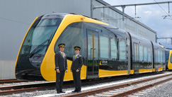
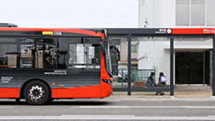
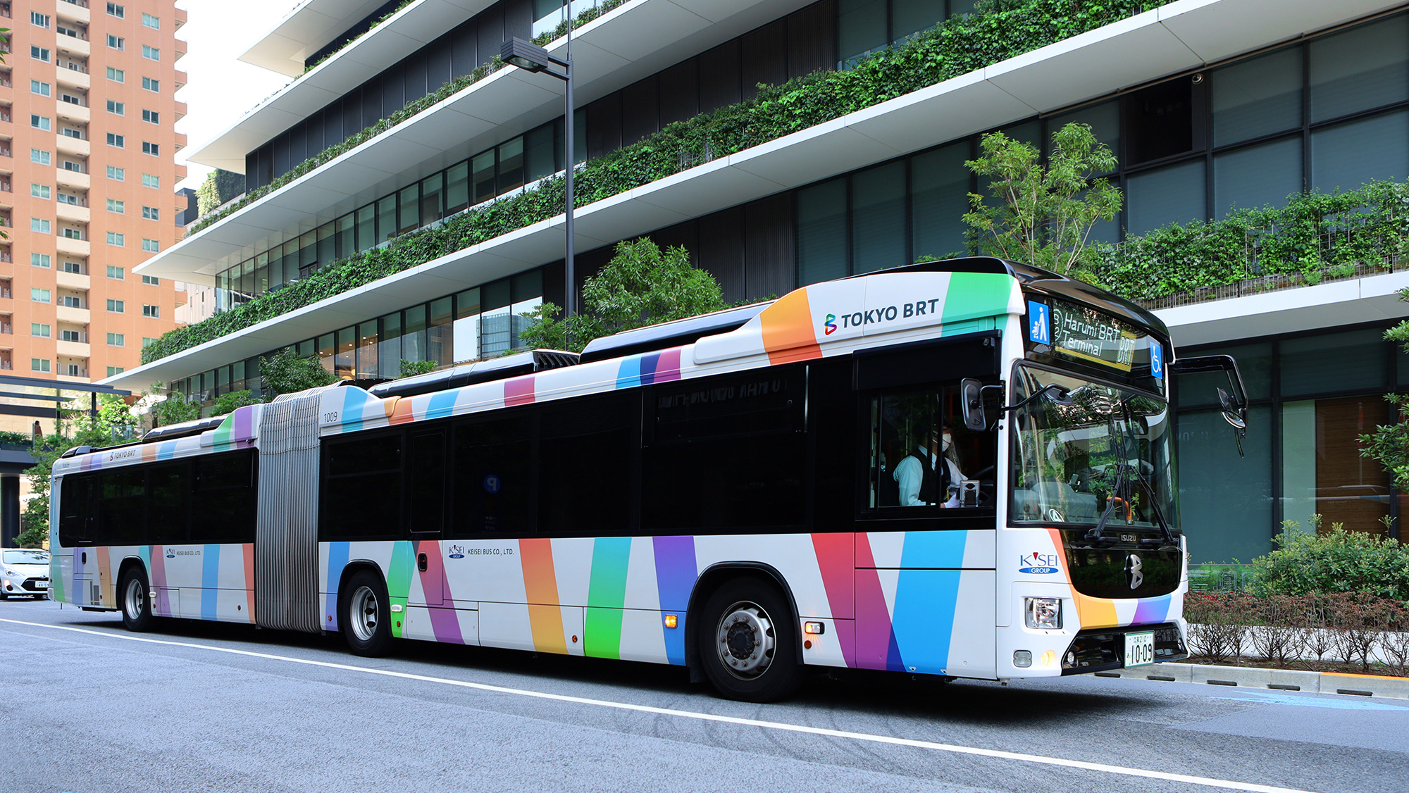
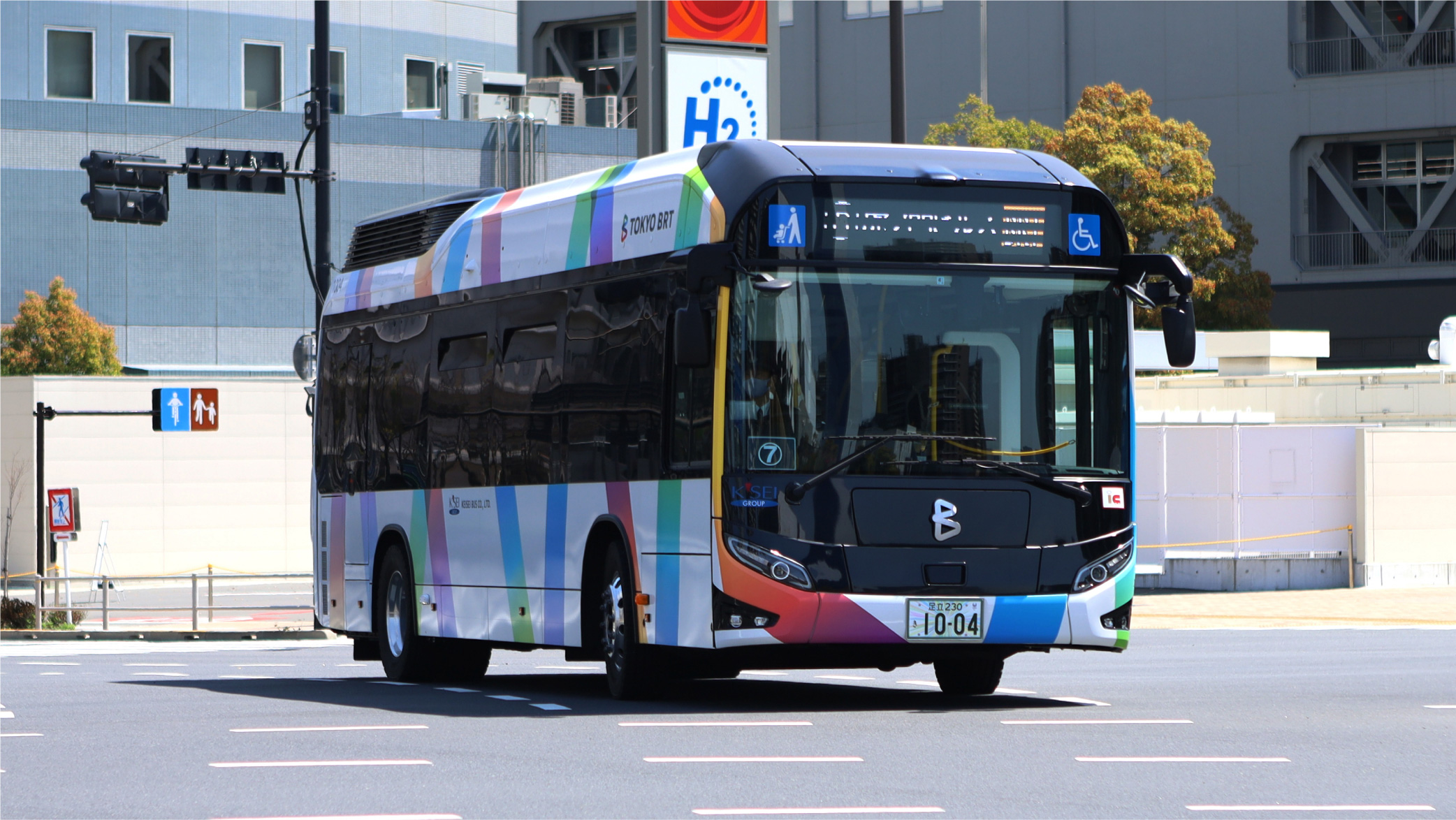
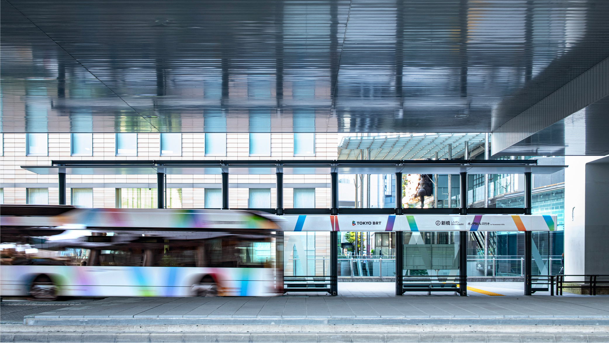
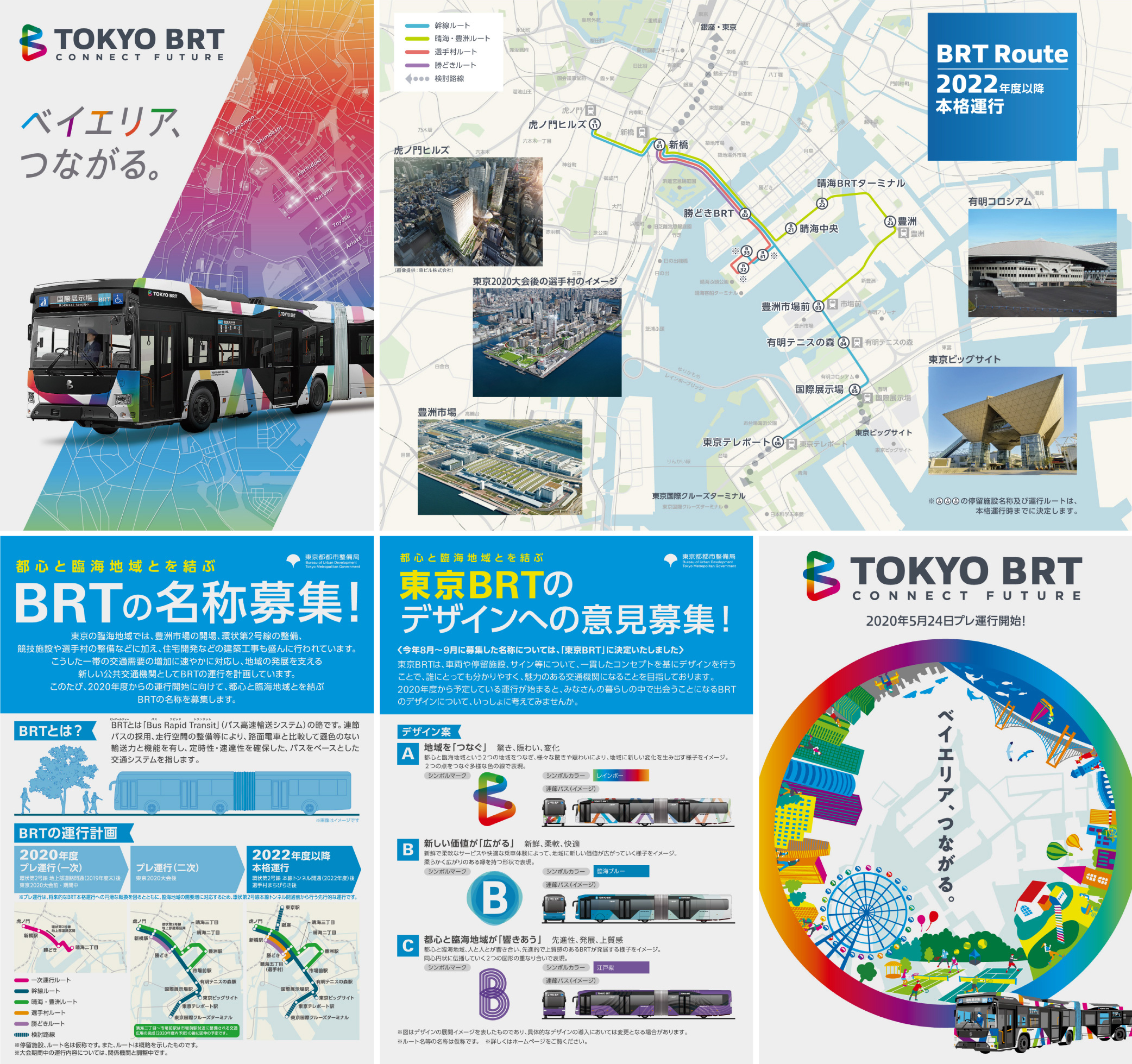
東京BRTは、東京の都心部と臨海部を結び、交通需要の増加への対応や地域の発展を支える新しい公共交通機関として開発されたサービスです。BRTとは「Bus Rapid Transit」バス高速輸送システムの略称で、連節バスをシンボルとしつつ、路面電車と比較して遜色のない輸送力と機能、定時性・速達性の確保を目指しています。
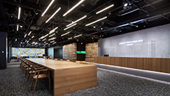
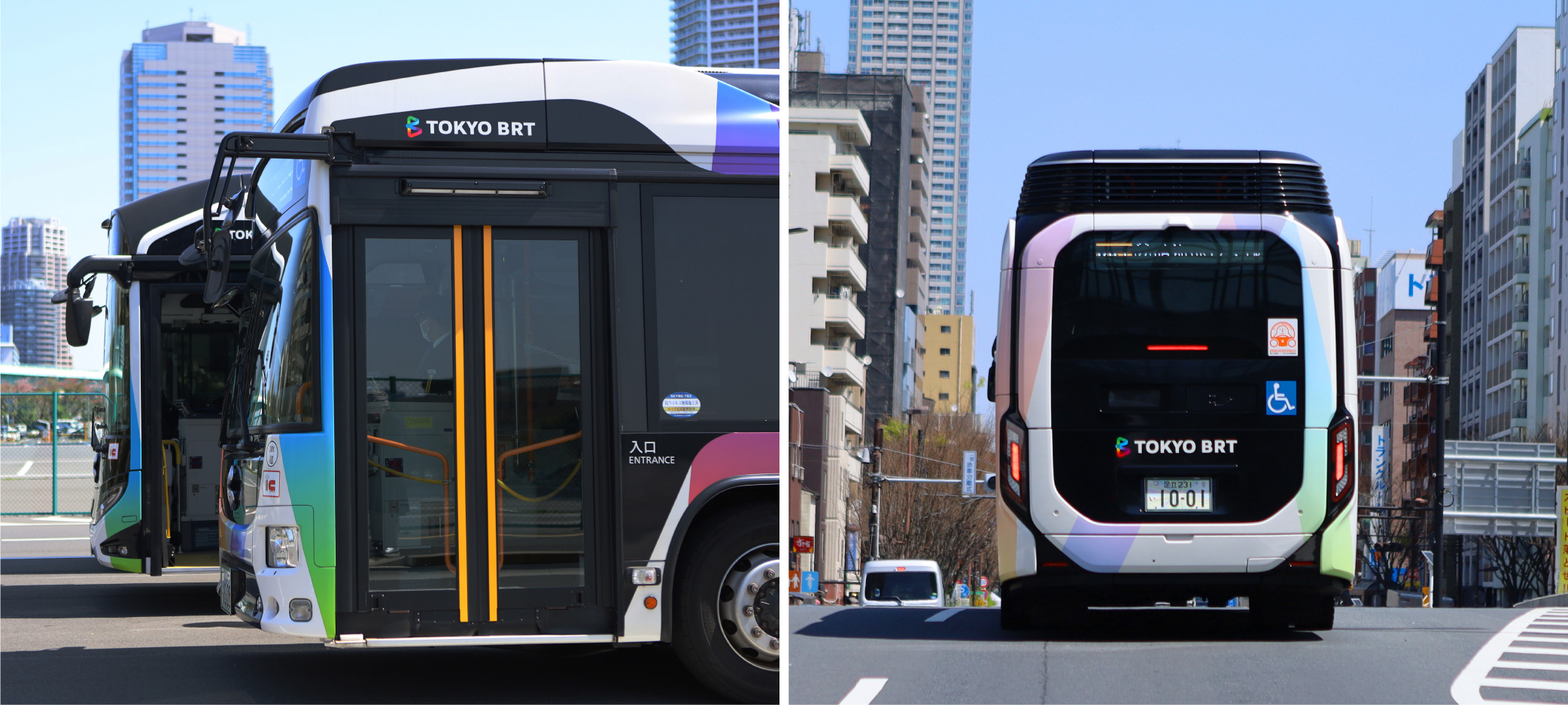
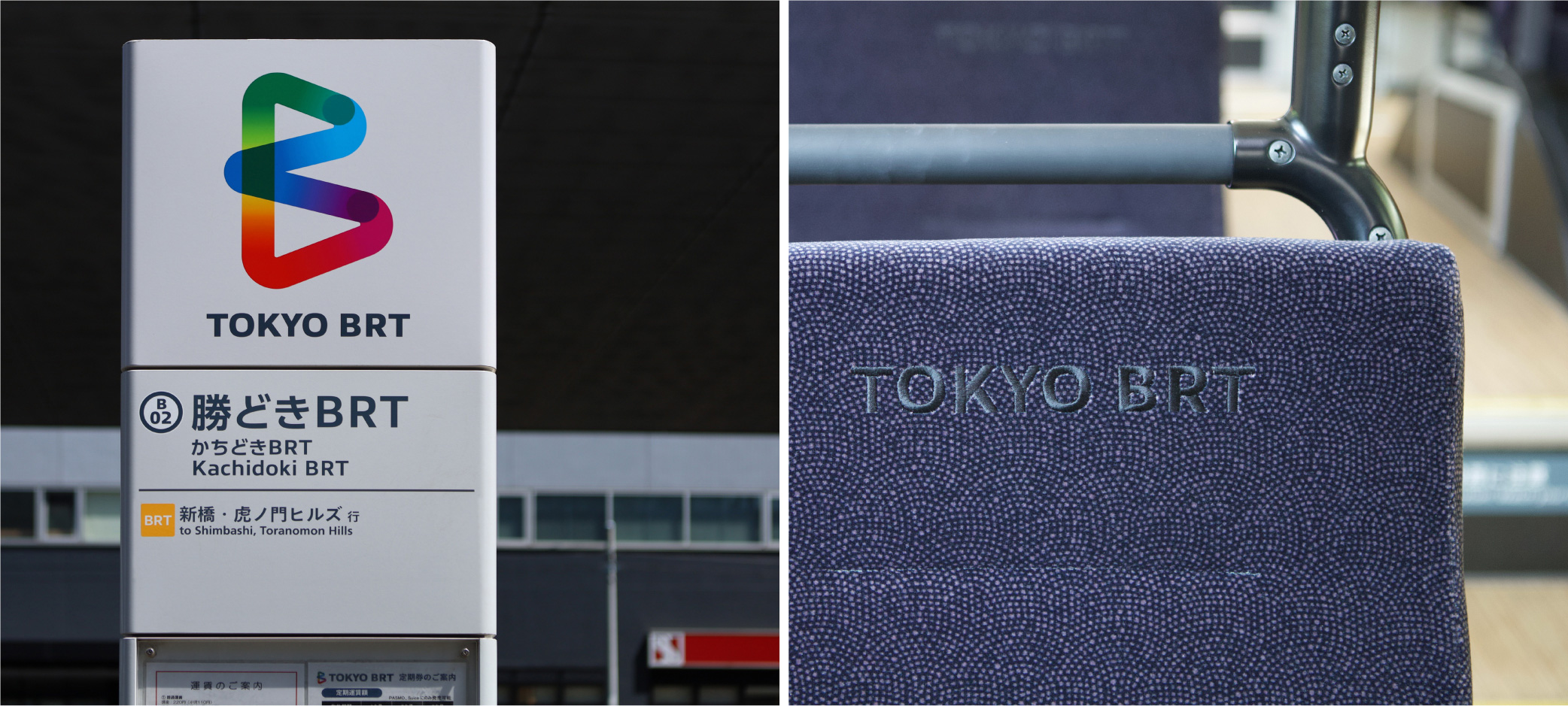
本プロジェクトはトータルデザイン業務としてGK設計を中心に、GKインダストリアルデザインとGKグラフィックスにより、バスの車両内外装デザイン、停留施設サイン・ファニチュア、シンボルマークをはじめとしたVI、広報媒体のデザインを3社協業にて行いました。
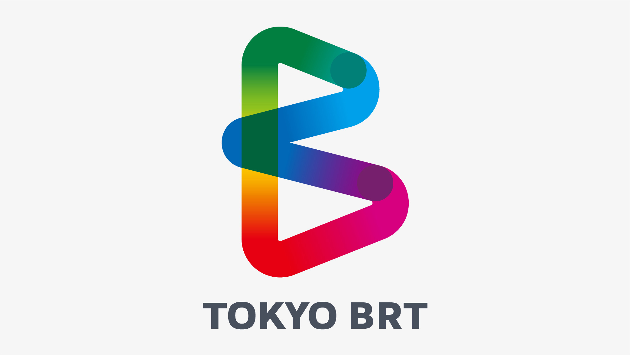
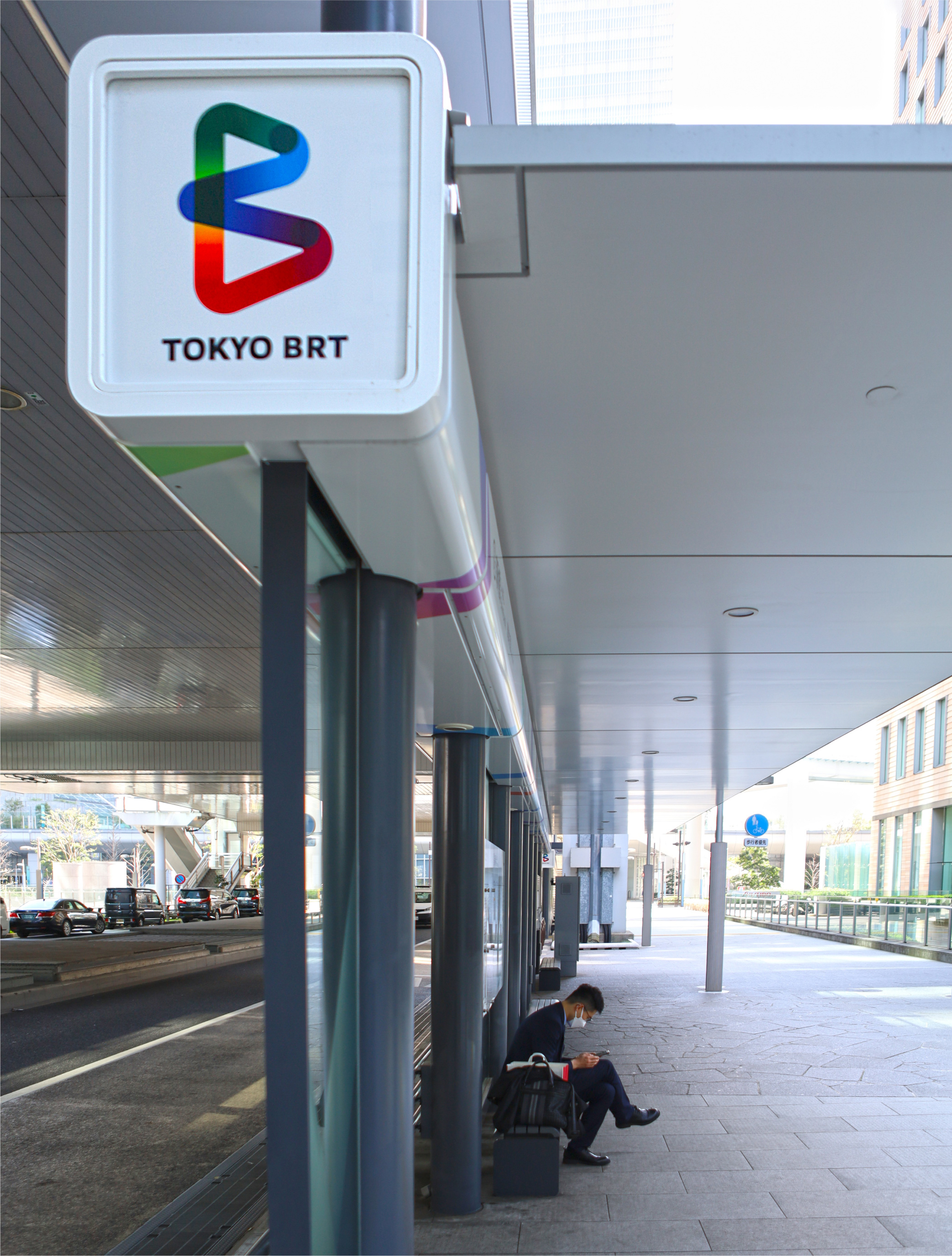
BRTの頭文字「B」を冠したシンボルマークは、都心部と臨海部を表す2点がレインボーカラーを描きながら繋がることで、新たな路線価値としての驚きや賑わい、変化を生み出す様子を表現しています。
サブグラフィックエレメントはグラデーションの帯や色面としてBRTの軌跡を表現しており、アプリケーション展開のさまざまな用途に合わせて帯の太さを変えたり、任意のグラデーション幅を抽出することで、シンボルの持つストーリー性を利用者へより情緒的に伝えられるよう設計しています。
Tokyo BRT is a new public transportation service developed to connect Tokyo's urban center and waterfront areas, responding to increasing transportation demand and supporting regional development. BRT, or the Bus Rapid Transit system, adopts a connected bus as its symbol. It is a high speed transportation system aiming to ensure speedy on-time mass transit comparable to that of streetcars.
This was a unified total design project, directed by GK Sekkei and with GK Industrial Design and GK Graphics collaborating as a team on the interior and exterior design of the buses, signage and furniture for the bus stops, visual identity including the symbol mark and public relations media design etc.
In the symbol mark, the initial letter "B" of BRT is drawn as a line in rainbow colors connecting the two points symbolizing the city center and the waterfront area, expressing the surprise, liveliness and transformation the new line will bring about as a new value.
The graphic sub-elements express the routes of the BRT in gradient bands and color surfaces, and are designed to allow interpretations, such as varying the widths of the bands or extracting arbitrary gradients to adapt to various application developments, and to convey their inherent narrative to users in a more emotional way.


写真家:橋本 陽Photographer: Yo Hashimoto
ロゴアニメーション:山道 貴太 https://silvre.myportfolio.com/Logo animation: Takahiro Yamamichi https://silvre.myportfolio.com/