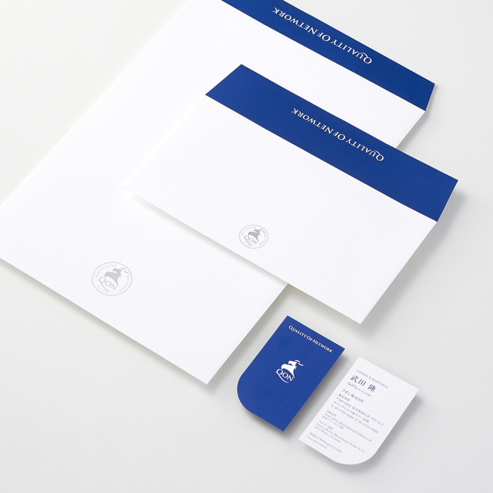
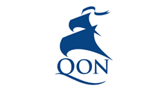
QON VI計画
クオン株式会社
Corporate visual identity for QON Inc.
QON Inc.
Category: Branding Date: 2016
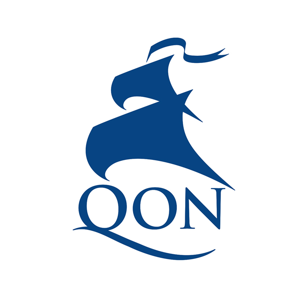
クオン株式会社は、企業と消費者をつなぐインターネットのコミュニティ開発と運営・コンサルティングを行う会社です。
インターネット黎明期の1996年に学生ベンチャーとしてスタートし、設立20周年を迎えるにあたり、企業活動の理念であるQuality Of Networkの頭文字から"QON"と称し、コーポレートイメージの刷新を図りました。フロンティア精神の象徴として、「船」をモチーフに定め、ロゴマークにしました。船が未来に向かい力強く進む姿は、創生期からインターネットの可能性を信じ、挑んできた企業文化を表現しています。
デザインマニュアルをはじめ、様々なアプリケーション展開によるデザイン支援を行っています。
QON Inc. is a firm providing development, operation and consulting services for internet communities that connect companies and consumers.
They started as a student venture in 1996, in the early days of internet communities. On their 20th anniversary they renewed their identity under the new name QON, taking the initials of their corporate philosophy Quality Of Network, for a refreshed corporate image. The image of a ship was selected as the mark to symbolize their spirit of venture. The full sails on a voyage toward the future represents their corporate culture of believing in the future of the internet since the very beginning and ever challenging new frontiers.
We have provided them with a total design support from the identity manual to applications on various media.
▶︎ クオン株式会社 オフィシャルサイト→ QON official site