FM福岡VI計画
株式会社エフエム福岡
FM Fukuoka VI Project
FM Fukuoka Incorporated
Category: Branding Date: 2008
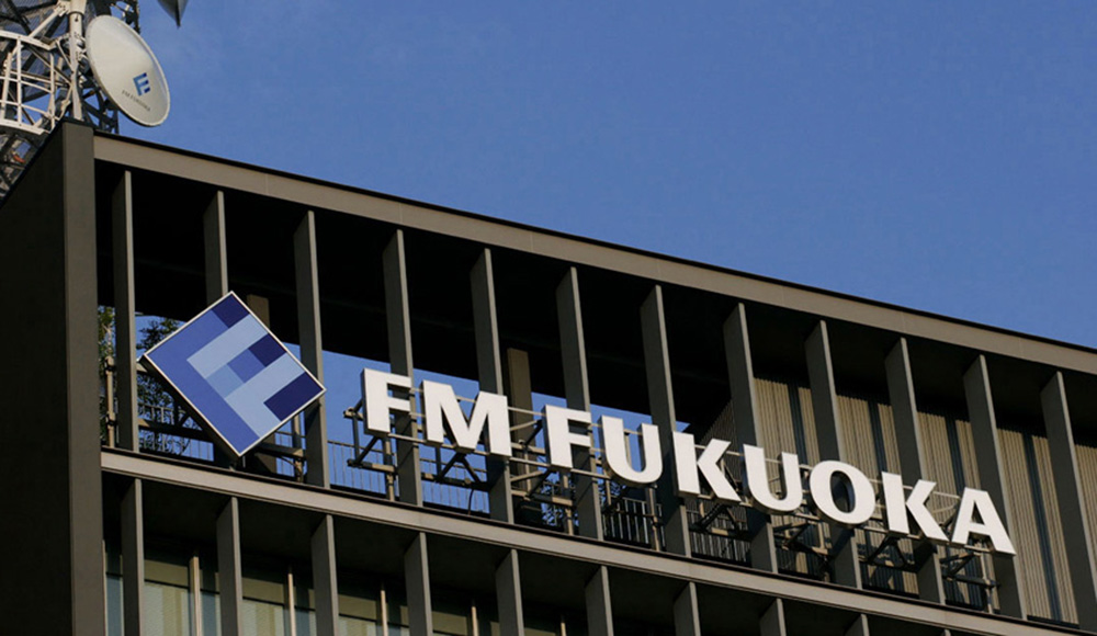
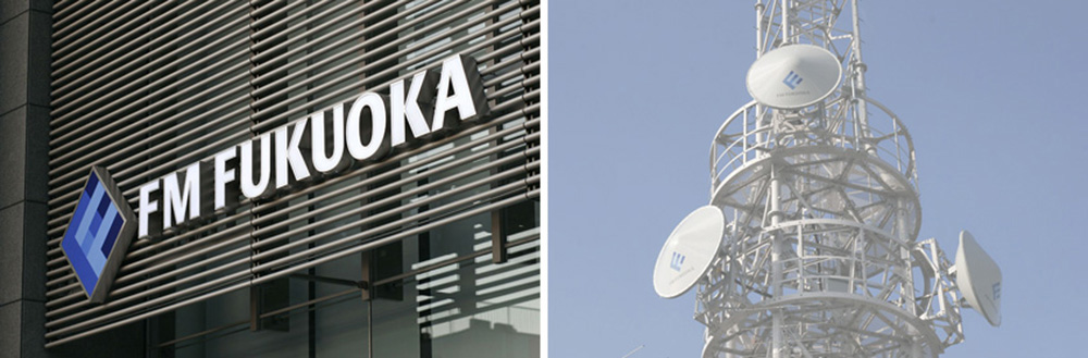
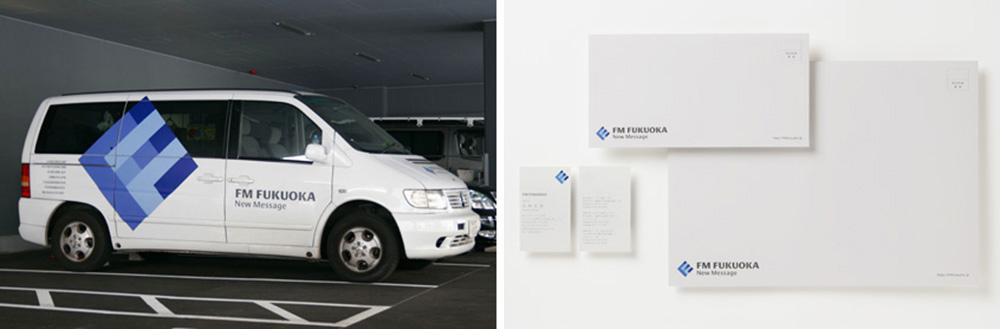
エフエム福岡は、福岡県内を中心とした北部九州一帯をサービスエリアとした放送局です。新しいシンボルマークは、エフエム福岡(FM FUKUOKA)のイニシャルである2つのFを組み合わせることで、「いつもリスナーのそばにいる」身近で親しみやすい放送局であることを表現しています。また2つのFの意味は、「いつもFukuoka(リスナー・地域)とFitしている」放送局であることも位置づけています。
色彩においては、エフエム福岡が「空」を介在したメディアであることから、複数の青による深みのある表現を用いました。また基本形体においては、古来から「完璧・完成」を表す正方形を傾けることで、情報への信頼感を伝えながらも、エフエム福岡の活気(動き)や若々しさを表しています。そして、パズルのような色彩構成は、にぎやかさや楽しさを伝えます。
FM FUKUOKA is a broadcast station serving greater northern part of Kyushu centered by Fukuoka prefecture. The new symbol mark expresses close familiarity "always getting along with listeners" by combining two Fs of the initial of FM FUKUOKA. Also the two F means the station "Always Fitting" Fukuoka (the listeners and the region). The depth of color was created by using multiple hues of blue, taken from the sky as the nature of the media FM FUKUOKA. In primary graphical form, delineated by a little tilting square, which is traditionally granted to represent "perfection and accomplishment," expresses vitality and youthfulness of FM FUKUOKA while telling confidence on information. And its puzzle like color scheme appeals lively and pleasant atmosphere.