「コスモ石油」VI計画
コスモ石油株式会社
“Cosmo Oil” Visual Identity
Cosmo Oil Co., Ltd.
Category: Branding Date: 1986

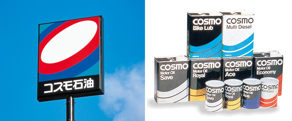
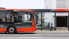
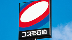
丸善石油と大協石油の2社合併によって発足したコスモ石油のVI計画です。新しいブランドの積極的な視覚訴求によって、企業イメージを高め、時代に対応するねらいが込められました。
「コスモオーバル」と呼ぶマークは、銀河系のイメージと、未来、協調、躍動を表し、「コスモプリズム」と呼ぶ色彩は、光の三原色をテーマに、明るさ、新鮮さ、斬新さを表しています。
サービスステーション(コスモステーション)やサインポール、タンクローリーなどに展開されたデザインは、導入当時、優れた洗練性を人々に印象づけました。
デザイン開発は、株式会社GK京都との共同によるものです。
協同:株式会社博報堂
The Visual Identity planning was for the Cosmo Oil which was the merger of the Maruzen Oil and the Daikyo Oil. Responding to times by positively and visually appealing a new brand, the planning aimed to promote business image and to respond to atmosphere of times.
The mark called "Cosmo Oval" expresses the image of the Galaxy, future, cooperation, lively motion. The color scheme called "Cosmo Prism" expresses brightness, freshness, originality with the theme of three primary optical colors. The design developed on the service station, sign pole, tank lorry alike impressed people with good sophistication when it was introduced.
Collaboration with: GK Kyoto Inc.
Cooperation: Hakuhodo Inc.