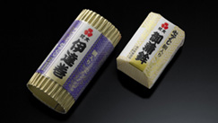
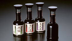
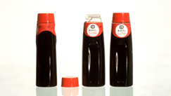
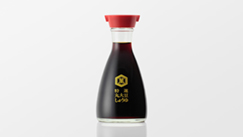
しょうゆ卓上びん(100ml)
キッコーマン株式会社
Soy Sauce Table Dispenser (100ml)
Kikkoman Corporation
Category: Packaging Product Date: 1991
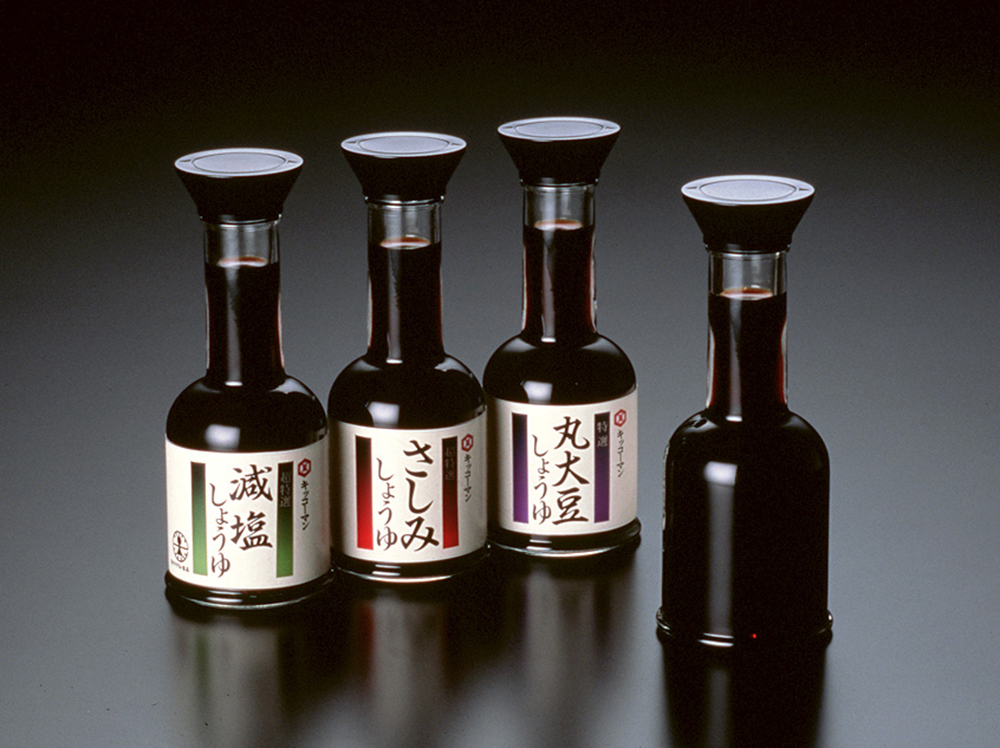
1980年代後半以降、日本の生活様式は変化し、「和」のあり方もまた変容していきました。本製品は、そのような暮らしの風景の変化に応答し、新しい卓上しょうゆ瓶のあり方を提案するものです。
容量を100mlに抑えることで、質の高いしょうゆを良好な状態で楽しめるよう設計しました。さらに、シリンダー状の首部により、新鮮なしょうゆがもつ美しいあかね色を引き出す構成としています。
造形においては、加飾による高級感ではなく、茶室の一輪挿しをモチーフとした凛としたかたちにより、現代における和の品質感をかたちにしました。また、シンプルな黒いキャップによる現代性と、瓶の下部に設けた古い瓶に見られる小さな膨らみによるクラシックな表情を組み合わせることで、造形全体に調和をもたらし、さまざまな暮らしの風景に自然に溶け込む普遍性をめざしました。
ラベルには剥離しやすいシュリンクフィルムを採用し、使い捨てではなく、卓上の道具として長く使い続けられることを前提にデザインしました。
日本パッケージデザイン協会:JPDA賞 金賞
グッドデザイン賞
Since the late 1980s, lifestyles in Japan have undergone significant change, and the notion of “Japanese” has also been transformed. This product responds to that shift, proposing a new approach to the tabletop soy sauce bottle.
By limiting the capacity to 100 ml, it is designed to allow high-quality soy sauce to be enjoyed in optimal condition. The cylindrical neck reveals the beautiful reddish hue characteristic of fresh soy sauce.
In terms of form, rather than relying on decorative elements to express luxury, the design takes its cue from the refined simplicity of a single-flower vase in a tea room, giving shape to a contemporary sense of Japanese quality. In addition, by combining the modernity expressed through a simple black cap with the classical character suggested by the subtle bulge at the base—reminiscent of traditional bottles—the overall form achieves harmony and aims for a universality that blends naturally into a wide range of living environments.
The label uses an easily removable shrink film, and the bottle is designed on the premise that it will be used not as a disposable container, but as a long-lasting tabletop tool.
Japan Package Design Association: JPDA Award, Gold Prize
Good Design Award