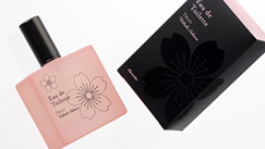
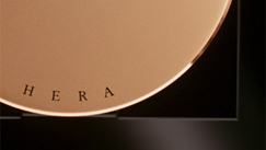
化粧品ブランド「HERA」
株式会社パシフィック・コーポレーション
“HERA”
PACIFIC CORPORATION (Korea)
Category: Packaging Product Branding Date: 1996
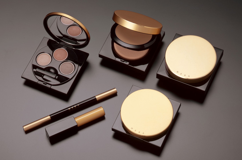
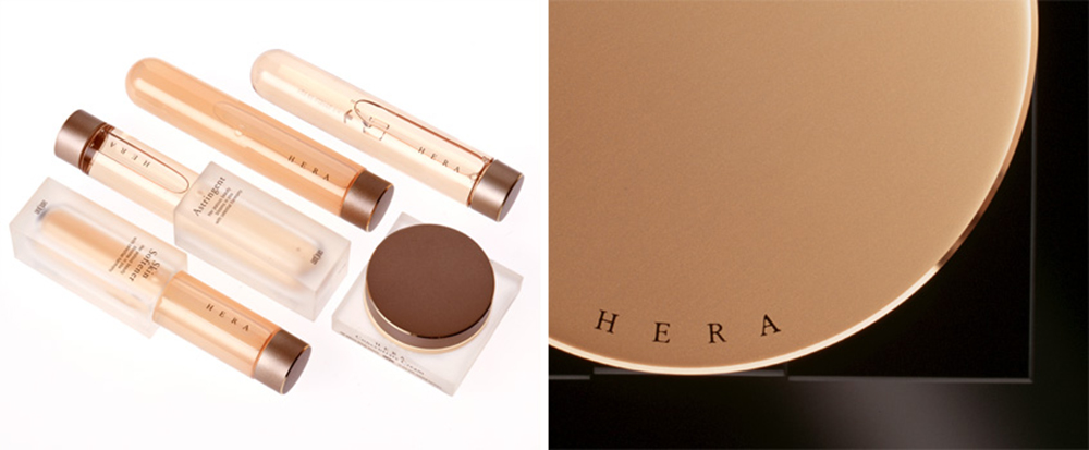
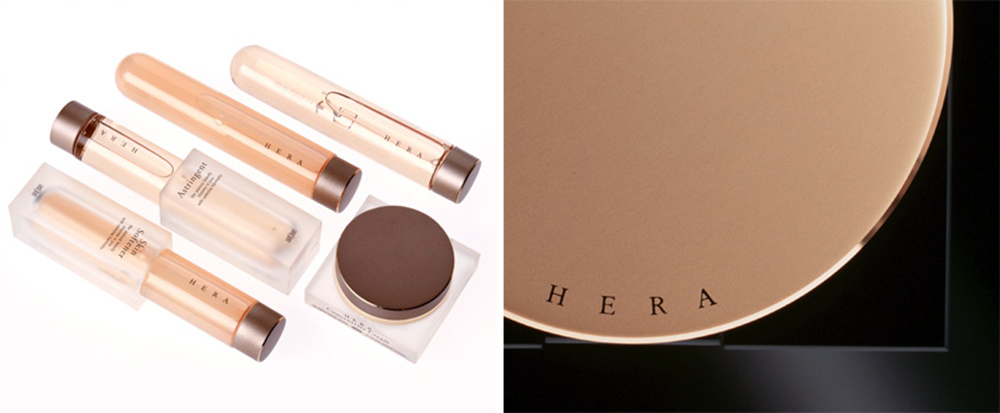
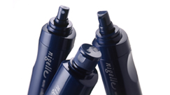
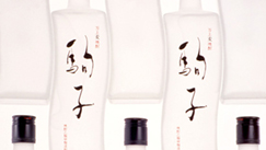
韓国化粧品業界の中心的存在であるPacific Corporation(現Amorepacific)のトップブランド「HERA」の立ち上げに参画しました。私たちは、東アジアのオリジナリティを反映することを提案し、ブランドコンセプトの構築、ブランドロゴ、プロダクト、パッケージのデザインを行いました。
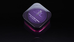
ギリシャ神話に由来するブランド名称から、「天空の女神『HERA』の美を地上の女性に伝えることがこのブランドの使命である」というストーリーを設定し、東アジアに通底する宇宙観である「天円地方説」に着目して、すべての容器造形の拠所としました。この円と正方形のみの単純な造形が、独自の高級感を生み出します。当時の韓国においては、欧米のデザインを参照した表現や加飾による高級感の訴求が主流でしたが、東アジアの文化を基盤とし、現代的で簡潔な造形によって強さを備えた新しい高級感を提示しました。「HERA」は大きな成功を収め、現在も韓国を代表するブランドとして展開されています。
We participated in the launch of HERA, the flagship brand of Pacific Corporation (now Amorepacific), a central player in the Korean cosmetics industry. We proposed reflecting East Asian originality and were responsible for developing the brand concept, as well as designing the brand logo, products, and packaging.
Drawing on the brand name’s origin in Greek mythology, we created a narrative in which “the mission of the brand is to convey the beauty of the sky goddess HERA to women on earth.” Focusing on the East Asian cosmological concept known as the theory of a round heaven and a square earth, we adopted it as the formal foundation for all container designs. This simple geometry—composed solely of circles and squares—creates a distinctive sense of luxury.
At the time in Korea, expressions of luxury were predominantly conveyed through design approaches referencing Western aesthetics or through decorative embellishment. In contrast, we presented a new form of luxury grounded in East Asian culture, characterized by contemporary, concise forms imbued with a sense of strength. HERA achieved significant success and continues today to be developed as one of Korea’s representative brands.