東京ヒアリングケアセンターVI計画
ヴァーナル・ブラザース株式会社
Tokyo Hearing Care Center visual identity plan
Vernal Brothers Inc.
Category: Branding, Environment Date: 2019
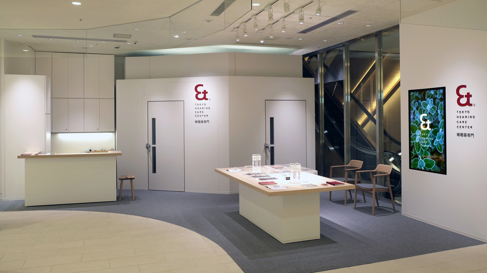
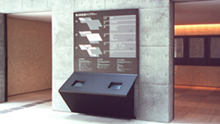
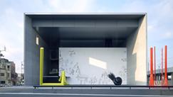
東京ヒアリングケアセンターは、日本ではいまだ十分に活用されていない補聴器について、難聴や補聴器で困っている人やその家族によりよく知ってもらい、活用してもらうことを目指しています。従来の補聴器店のあり方を超えて、誰でも入りやすい「補聴器への新しい入口」として、本人はもちろん家族や周りの人も気軽に補聴器に触れられる、オープンな店舗とコミュニケーションを計画しました。
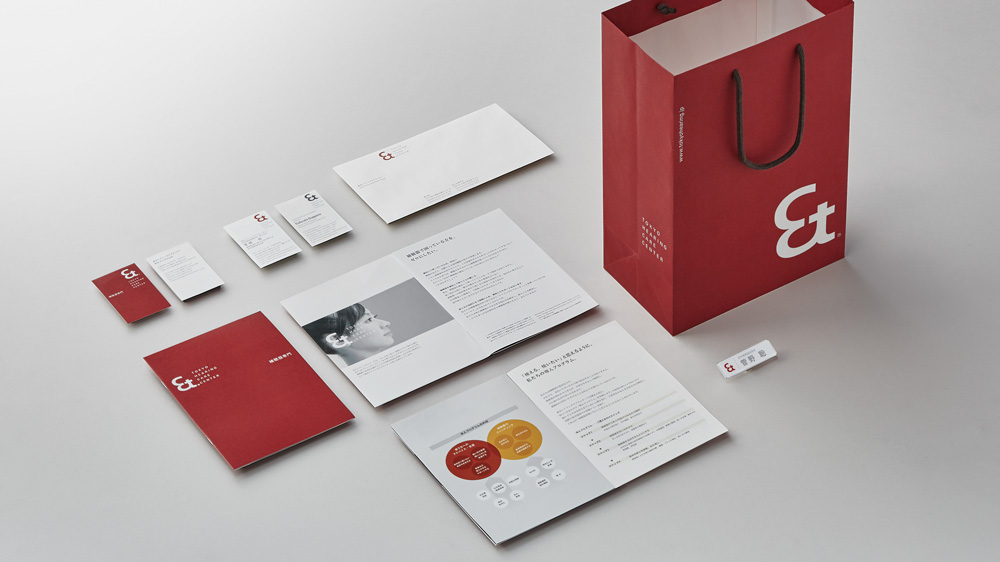
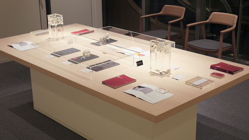
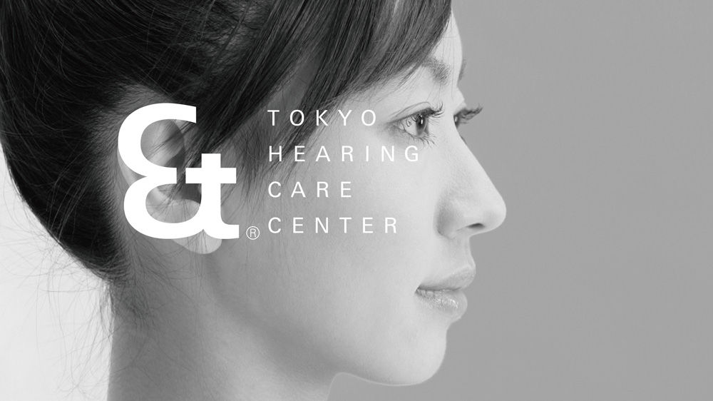
ロゴ等に使用されているシンボルマークは、ラテン語の "人と人をつなぐ" ための記号、アンパサンド(&)と「耳のかたち」を元にデザインしました。これは適切な補聴器によって、円滑な対話を実現し、人と人をつなげたいという東京ヒアリングケアセンターの想いを具現化したものです。私たちは2009年より、ロゴや各種アイテム、店舗、webサイトまでトータルでデザインを担当しています。
[2020年度グッドデザイン賞 受賞]
Hearing aids are still underutilized in Japan. Tokyo Hearing Care Center’s mission is to make hearing aids better known and utilized by individuals and families of people with problems in hearing or with hearing aids. The shop goes beyond traditional hearing aid shops, offering a "new entrance to hearing aids" welcoming everyone. We designed an open shop atmosphere and communication plan, open to users, family and friends alike, so they can easily get to know hearing aids.
The symbol mark design is based on the Latin ampersand (&), a symbol to connect people, and the shape of an ear. It symbolizes Tokyo Hearing Care Center's vision to realize smooth dialogue and connect people through the use of appropriate hearing aids. Since 2009, we have been supporting them through an integrated design of the logo, various communication tools, shop and website.
[Good Design Award 2020]
→ 東京ヒアリングケアセンター 公式ウェブサイト→ Tokyo Hearing Care Center official website