大山案内サイン統一化プロジェクト
伊勢原市、株式会社小田急エージェンシー
Total unification design of signage system for Oyama
Isehara City, Odakyu Agency Inc.
Category: Environment Date: 2015
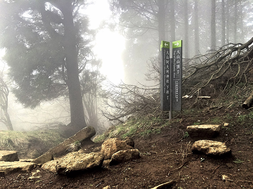
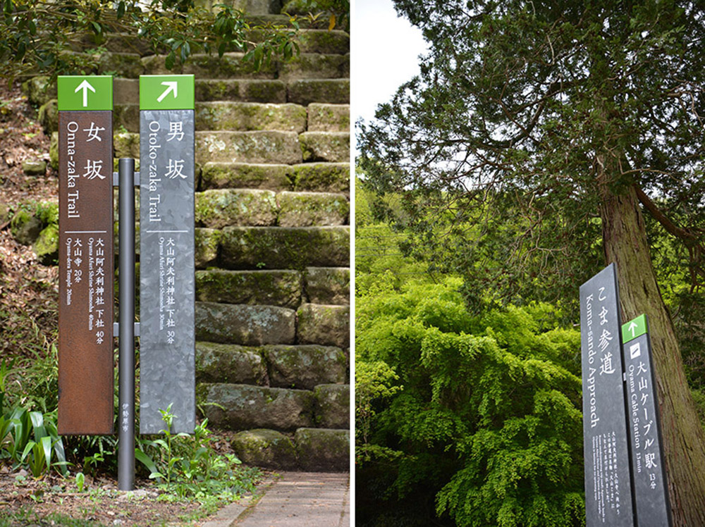
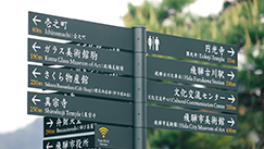
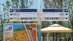
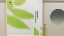
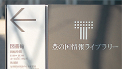
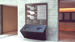
神奈川県を代表する山、大山への来訪者を誘導する案内サイン統一化プロジェクトです。
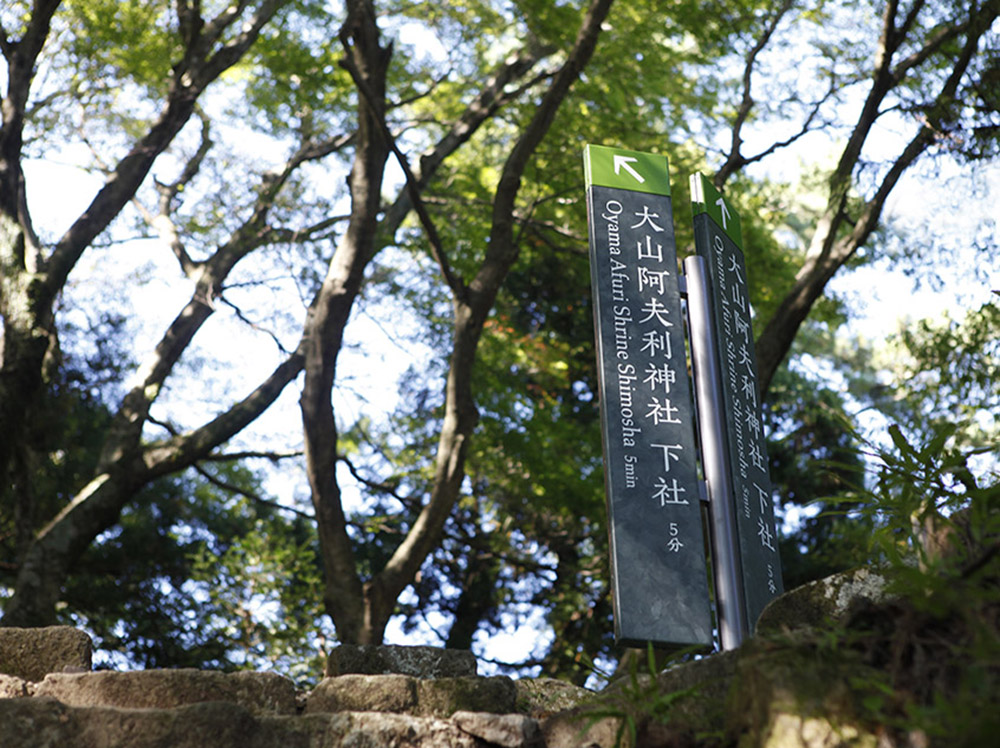
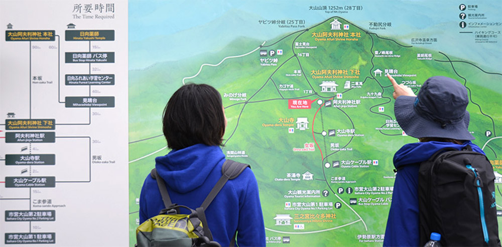
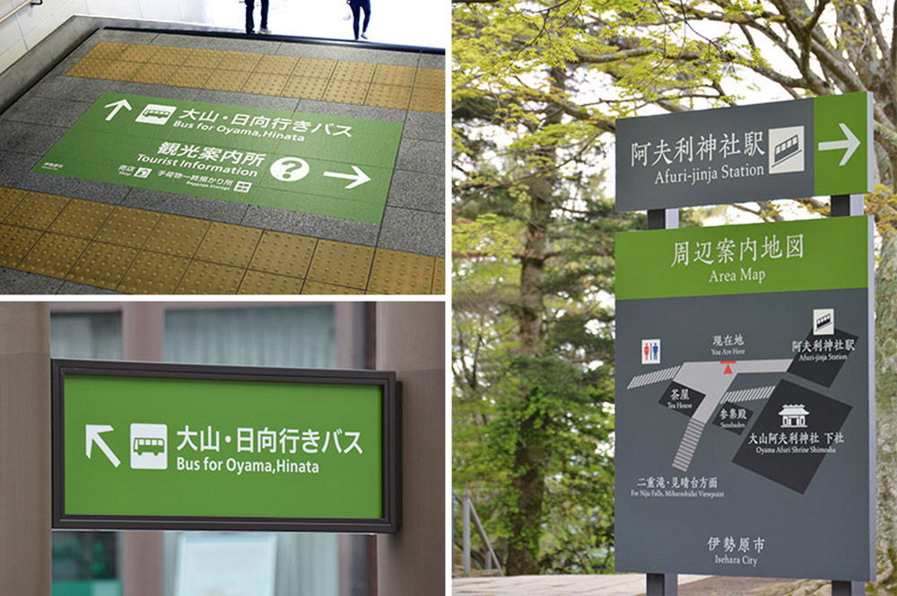
来訪者のメインルートとなる駅から登山道までの22ヶ所のサインを一貫したサインシステムで構築しました。同時に、古くから山岳信仰によって栄えてきた「大山らしさ」として、富士山や伊勢神宮のような「厳かさ」「深淵さ」を表現することで、土地の魅力を顕在化しています。また、市街地から山中という異なる環境に応じて、色の面積とメインの書体を使い分けることで、景観に相応しい表情へと変化させています。ルート上重要な地点には、従来の擬木を使った誘導サインに替わり、縦型の矢羽根型サインを新規に設計しました。国定公園の景観に配慮した素材や仕上げを選定し、日本語ならではの縦書き表記を用いた新しいサインのスタイルを創出しています。
A project to unify and improve the navigation signage for visitors to Oyama, the mountain that represents Kanagawa Prefecture.
We designed the navigation signs for 22 spots following the main route for visitors, from the train station through the climbing trail, as a consistent signage system. Mount Oyama has been the object of religious respect and faith since ancient times, and we highlighted this local cultural identity by adopting a deep solemn expression like that seen for Mount Fuji or the Ise Shrines. In response to the different surroundings varying from city streets to hiking trails, the size of colored areas and the font styles on the signs are adjusted to make the appearance appropriate for each landscape. In major waymark locations a new type of vertical signs was introduced to replace the conventional imitation log sign. The quality of material and finish were selected to suit the quasi-national park landscape, creating a new style of signage through the application of vertical typesetting unique to the Japanese language.