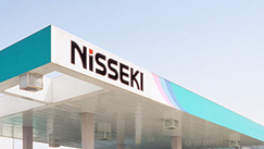
「日本石油サービスステーション」サイン計画
日本石油株式会社
“Nisseki Service Station” Signage Planning
Nippon Oil Co., Ltd.
Category: Environment Date: 1991
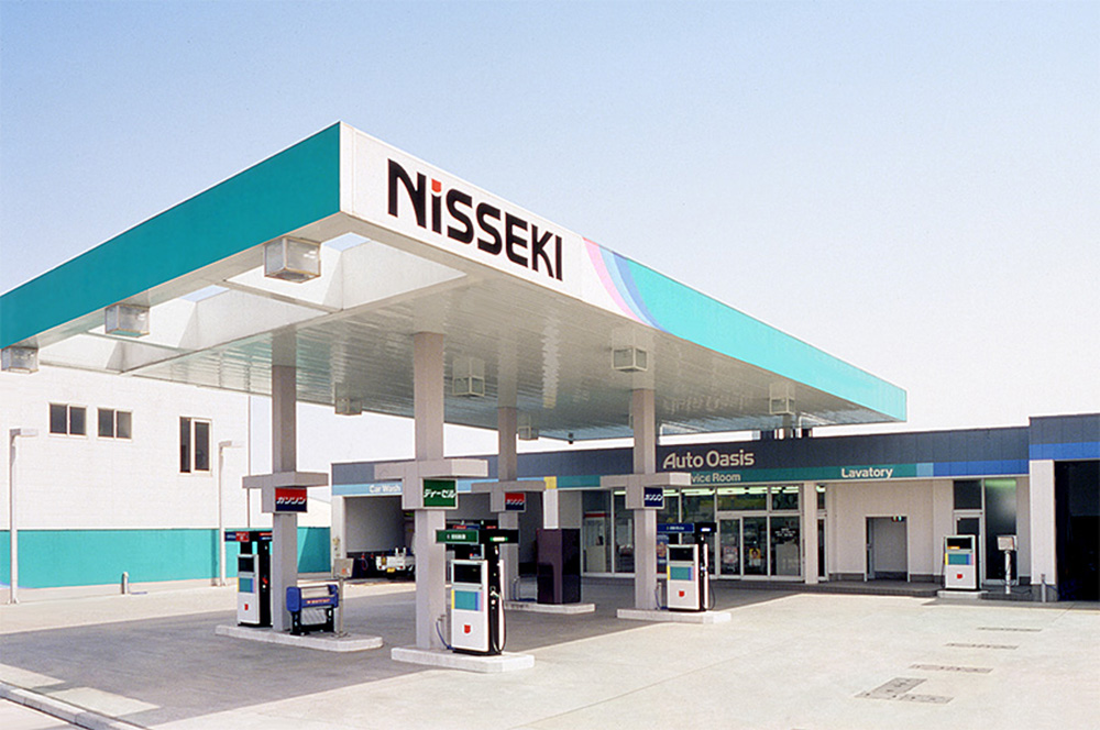
1990年代初頭、石油輸入自由化の進行に伴う競争激化の時代を迎え、国内最大数の系列ステーションを持つ日本石油が、環境との調和、お客様と従業員にとっての快適性をテーマに行った、店舗デザイン一新プロジェクトです。
「サンライズマークの太陽の光を受けて光彩を放つ緑の地球」を基本モチーフとして、サンライズマークをとりこんだメインロゴタイプの設計から、店舗や什器、タンクローリーのカラーリングまでを一貫したデザインシステムとして開発しました。
この計画ではコスモ石油での経験を活かし、短期間で膨大な数の店舗を模様替えするための、ノウハウが発揮されました。
For Nisseki in early 1990, holding nation's largest number of subsidized stations, its business was facing heavy competition as deregulation was going on. The project was planned for the whole renewal of store design. It took, as its theme, the comfort for customers and employees and the harmony with environment
The primary motif of the de-sign was "the green earth re-flecting the sunshine of "sunrise mark." The design was developed as a consistent design system. The system consisted of designing main Logo-type adapting the sunrise mark, stores and fixtures, the coloring of tank trucks.
Design knows how, obtained through the experience of Cosmo project, was fully utilized for renewing tremendous number of stations in short time.