住商フーズ VI計画
住商フーズ株式会社
Visual Identity Plan for SC Foods
SC Foods Co., Ltd.
Category: Branding Date: 2019
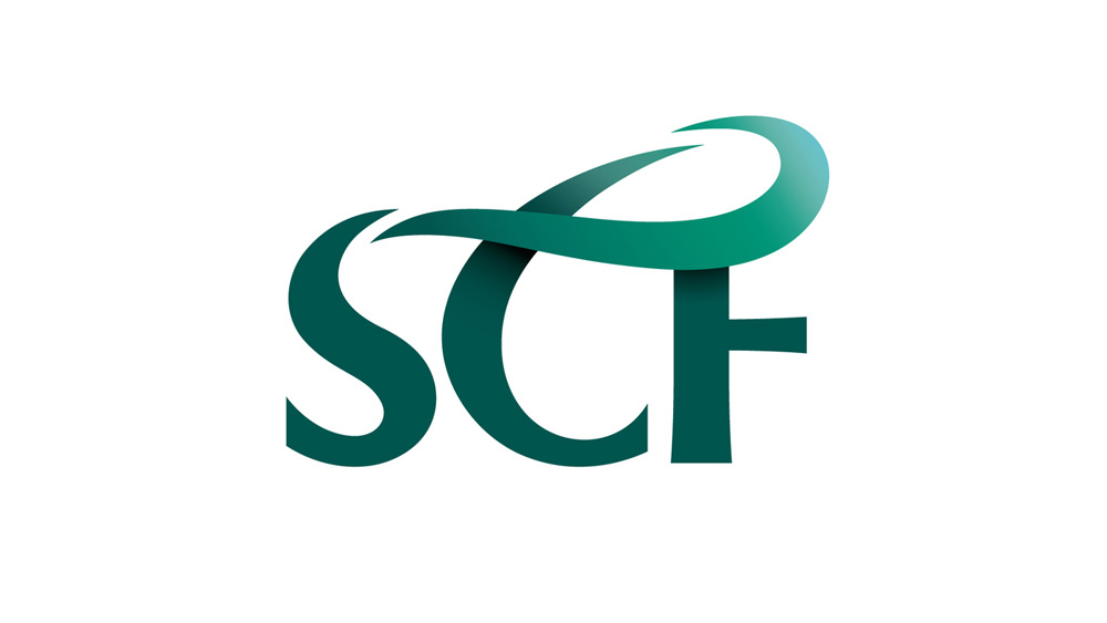
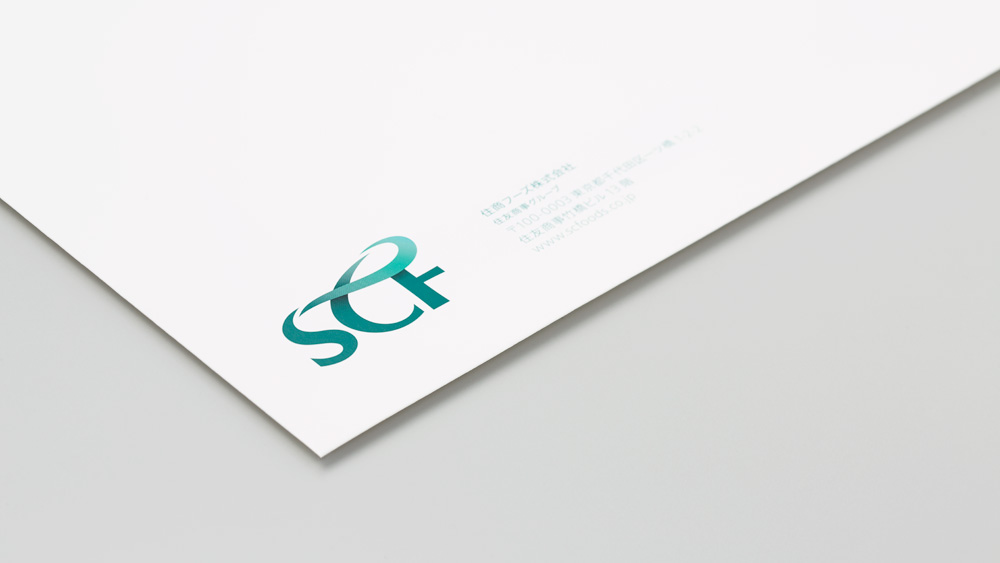
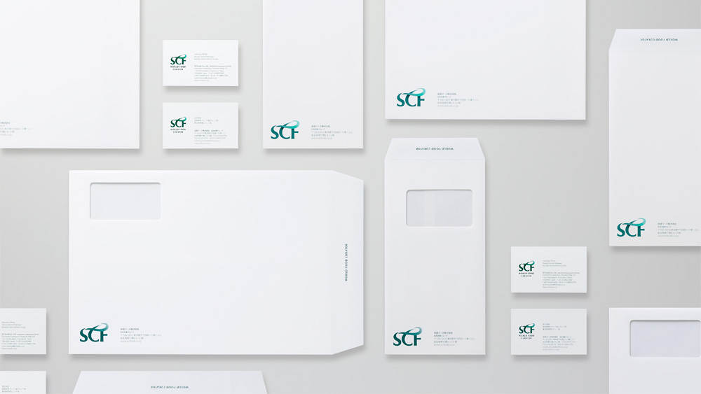
世界中の食材を取り扱う商社である、住商フーズ株式会社のVIリニューアルを行いました。
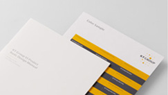
住商フーズ株式会社は、最適で安全な食材を調達し人々の食卓へと提供することを理念に運営されています。企業イメージを一新するにあたり、欧文社名の頭文字S,C,Fを繋ぐループ形状を、食の安全・安心を象徴するグリーンで表現したコーポレートマークを制作し「農業から畜産・食品への連鎖」と、食のプロフェッショナルとして「世界の食文化を繋ぐ」という意味を込めています。名刺、封筒は白を基調にシンプルなレイアウトで展開し、スマートな清潔感を演出しました。
Design renewal of the visual identity of SC Foods Co., Ltd., a trading company that handles food ingredients and groceries from all over the world.
SC Foods’ core philosophy is procuring safe food ingredients to best suit the objective, and conveying them to the consumer's table. In renewing its corporate image, we created a corporate mark with a loop connecting the initials S, C and F of the company name in green, symbolizing food safety and security, to express "the chain from agriculture and livestock to food products" and "connecting food culture around the world" as a specialist in food industry. Business cards and envelopes were developed in a simple layout based on white to create a smart, clean look.