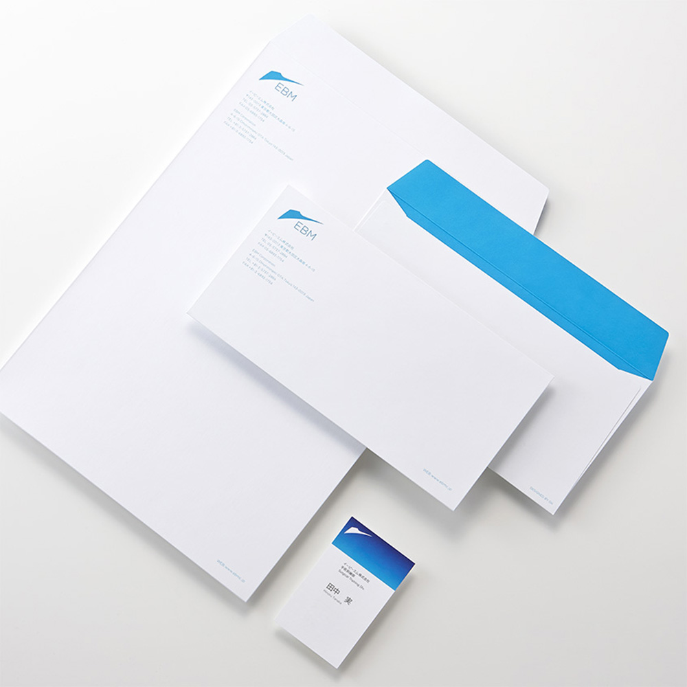
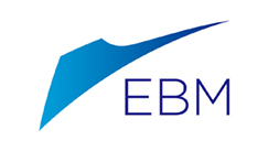
EBM VI計画
イービーエム株式会社
Corporate visual identity for EBM Corporation
EBM Corporation
Category: Branding Date: 2014
EBM(イービーエム株式会社)は、主に医療用機器の開発から製造販売をおこなっている2006年に工学部の学生発ベンチャーとして創業した企業です。Engineering Based Medicine(工学に基づく医療)の理念からEBMを社名としています。
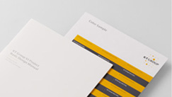
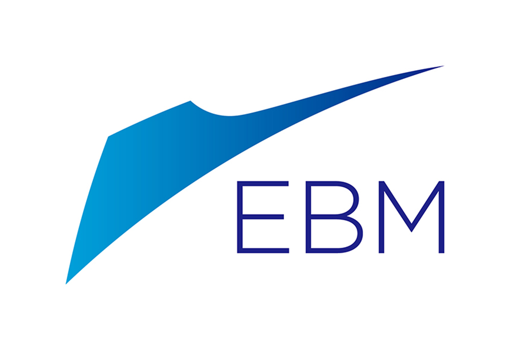
2014年のVI変更において、「外科医療のメス」「工学の歯車」をモチーフに世界へスピーディーに切れ込んでいくというメッセージを込めた新しいシンボルマークを製作し、各種アプリケーションへの展開を行いました。
GKグループでは、工場建築からソフトウェアブランド開発にいたるまで多岐に渡るデザイン支援を行っています。
EBM is a company specializing in the development and sales of medical equipment, originating as an engineering student venture in 2006. The company name comes from its philosophy Engineering Based Medicine.
In their identity renewal in 2014, we designed the new symbol mark and developed various applications. The mark draws from the visual images of the surgery knife and the engineering gear tooth, representing their corporate message "being the cutting edge to lead the world."
GK Design Group has been supporting them in various design fields, from factory architecture to software brand development.
→ イービーエム株式会社オフィシャルサイト→ EBM Corporation official site