コンピューター文字設計
富士通株式会社
Typeface Design of Japanese for Computer
FUJITSU LIMITED
Category: Web/UI Date: 1974
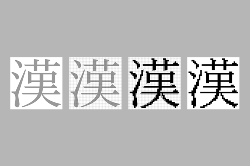
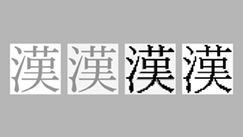
日本ではコンピュータ普及の初期時代、カギの一つは複雑な文字体系に安価に対応したフォントの開発でした。当時の通産省によって方針化された36ドット方式に則り、写植文字から機械的分解をしたところ字形が複雑で字の態をなさない状況でした。そこで、字癖がない一人による手分解の依頼がありました。後に辞書の編纂にも応じるため、漢字だけでも訳8万字。他に仮名や記号類。また明朝とゴシック、JISの32ドット方式も加えた膨大なプロジェクトとなりました。日本の文字文化をコンピュータに写す「写経」といった位置づけで行われた2年間の努力は、高性能文字の評価を得ましたが、やがて急速な技術進歩により主役の座を去りました。
In the early era of the computer age in Japan, the outset of an issue was the development of a font in quick and economic job to cope with complicated system of Japanese characters. The work was done first by breaking those characters used by photo-typesetting industries down into thirty six dots, the system guided by the then Ministry of Trade and Industry, ended up with visually too complicated characters even hardly able to be called a Japanese character.
With that background, we were commissioned to the break down work by a single person without peculiarities in his/her handwriting. Later the project developed into a tremendous work load; not only about eighty thousand kanji, Chinese characters, to cover dictionary edition but kana (phonetic symbol) and many kinds of the other symbols also followed by typeface "Mincho" and "gothic," thirty two dot system from Japanese Industrial Standard.
By having placed the project like hand-copying of sutras of literal Japanese culture by using a computer, effort for two full years, was implemented. However the two-year work earned good reputation, the system had gradually faded out due to rapid technological innovation.